Packaging must pack a bigger punch
October 2007
 Allen Adamson
Managing Director
While it certainly confirmed what I know, it didn't take a recent New York Times article to get me thinking about the rise of package redesign as a new, old branding tool.
I can stroll down any supermarket aisle, any drugstore aisle, any discount-retailer aisle and get all the confirmation I need. The number of well-known brands taking on package makeovers has grown exponentially in the past couple of years.
It used to be standard operating procedure for consumer goods to keep package design static for six years or so. But now we're seeing major renovations to a rapidly multiplying number of brand-name bottles, bags, boxes, and cartons. Why this incredible shift?
Fragmentation
From my purist's branding perspective, I'd say there are two key dynamics driving marketers to take second and even third looks at their packaging to determine if it's working as hard as it should be. The first is media fragmentation. With the launch of one technological gizmo after another, coupled with various social influences, media fragmentation has become a more shattering experience than ever.
It isn't just that there are TV channels in every room of the house with shows for every age, life stage, and area of interest; there are online channels in every room featuring banner ads, video feeds, and podcasts for every age, life stage, and area of interest.
But forget inside the house. Take a step outside and the media opportunities further multiply. Take a look in any direction and there they are: ads behind home plate, on the tops of taxis, in restrooms, on racecars, and supermarket carts.
As media are sliced and diced into a thousand points of light, marketers are struggling to get even the slightest blips of attention. And to do so, it's no surprise that many smart marketers are turning their attention to one of the best values in branding real estate: the package.
Packaging a story
The last thing consumers see before they make a purchase also happens to be among the last pure branding spaces available, what with all the do-it-yourself media saboteurs out there. The fact is that a product's packaging can tell a clear and simple story about what the brand stands for even before consumers open it. And with so many brands vying for attention, a brand whose packaging communicates simply and clearly what it promises to deliver is generally the most successful.
When it comes to the package, people can't ad-skip as they skip down a supermarket aisle, nor do they have to download anything to understand why a brand is appropriate to their age or interests.
Done right, the outside tells all. Pepsi, for example, which had changed the look of its cans and bottles only 10 times in 100 years, plans to change its design every few weeks as a way to grab the attention of the generation it seeks.
If you don't have luck connecting with the audience you want as they sit in front of TVs or laptops, sooner or later they're going to show up in front of a retail shelf. That's a great segue to the second dynamic driving rekindled interest in packaging as a branding tool: the increasingly difficult time brands are having differentiating themselves in a sea of shelf clutter. Any brand research worth its salt will tell you that differentiation, together with relevance, is the most critical factor in brand success.
Put design to use
If you can't promise and quickly prove why your brand is different from the competition's, consumers will pass you by without a backward glance. Marketers are rediscovering that the design and basic functionality of a package is a fantastic way to signal what makes a brand different.
Actually, packaging is one of the only consumer touch points at which a brand can literally reinforce the core difference between itself and the brand sitting next to it. Apple, for example, has been using its packaging as a powerful brand-differentiating tool since day one. The elegant, simple, functional design of its packaging supports the elegant, simple, beautifully functional design of its products.
Evian water, too, uses its packaging as tangible proof of what makes it different. Whether it's the ergonomically designed bottles perfect for the gym or the chic and graceful restaurant bottles, the outer Evian brand experience immediately conveys its inherent brand promise.
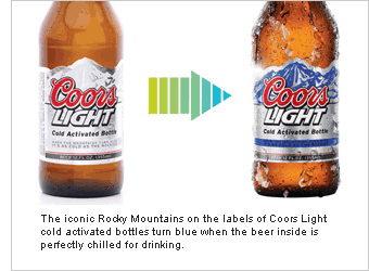
The portable Yoplait Go-Gurts, the nifty Campbell's Microwavable Soups, the Nabisco 100-calorie packs that assist those who diet, and the Coors Light bottles for those who love cold beer are all great examples of incorporating a brand's differentiating promise into its package design. Form and function are intrinsically linked.
So where's it all going? Generally speaking, it's essential that packaging decisions be allotted an extra degree of scrutiny and due diligence before branding strategies are implemented.
More specifically, there are three key trends shaping up to become the new standard operating procedures with regard to package decisions:
1. Green is good.
The number of consumers concerned about the environmental impact of what they buy has evolved to mainstream. People-not just tree-huggers-want to know immediately that what they're buying is safe for the planet without having to spend time reading the fine print on the back of the bag or bottle. More packages will be designed to instantly signal that whatever is inside delivers green benefits.
Tide Coldwater, 100% recycled Timberland shoe boxes, and Annie Chin biodegradable food containers are just a few of the many brands communicating clearly on the outside that it's easy for consumers to be green.
2. Smart is good.
In my book BrandSimple, I write about the "Seinfeld" question as it relates to brands: "Ever wonder why..." Jerry muses, followed by an observation of the obvious. In this vein, ever wonder why all prescription-medication bottles look the same and are so difficult to read?
I predict more marketers are going to get smarter when it comes to addressing questions like this, much as Target has done with its brilliantly designed, easy-to-read prescription bottles.
And much in the way Hellman's has done in delivering its mustard and mayonnaise products in three packages designed for the way we actually use the delicious contents: "Wholesome good taste you can spread, squeeze or dip." Thank you very much.
3. Easy is good.
The simplest thing I can say about this is that it's about time. No one has time to struggle with a plastic clamshell package, hacking it to pieces to get it open and scaring the kids with language you've forbidden them to use. No one has time to cut though layers of plastic or glued-to-the-max wax-paper wrappings you're forced to rip open with your teeth (something else you've forbidden your kids to do).
If new packaging is in your brand's future, I strongly urge you to make it easy to use. People want simple.
Wishbone paid heed to this with its salad-dressing spray bottles. One easy, little pump, and I get all the taste I need. OXO has done it from the beginning. It applies its brand promise to make easy-to-use household tools to its packaging as well.
Bottom line: Use the package to enable folks to immediately understand what makes your brand different and why they should care.
It's a new, old, and very powerful way to help you get the attention you're after.
© 2007 Crain Communications. All rights reserved. This article was first published in the 22 October 2007 issue of Advertising Age.